Hand-held marketing
BY COLIN BECKINGHAM
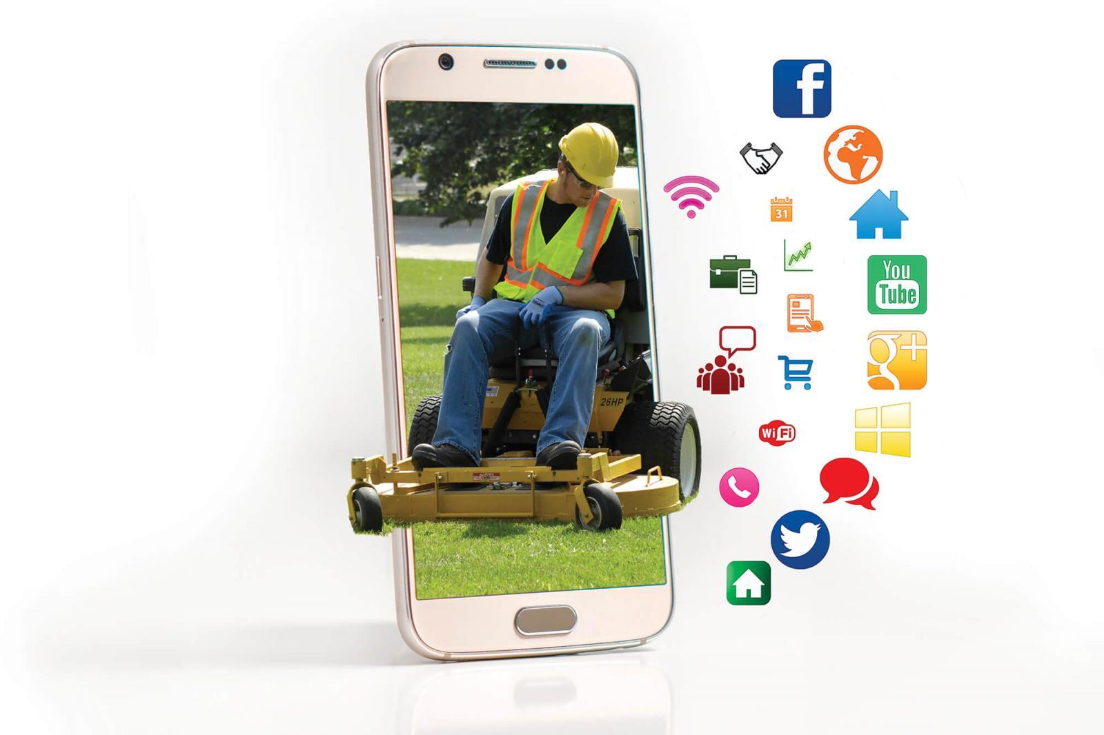
As online traffic moves briskly to smartphones, landscape companies are working to compete in the mobile ecosystem
In 2016, worldwide mobile Internet usage exceeded desktop usage for the first time. Should landscapers, nurseries and garden centres in Canada sit up and take notice? While mobile usage world-wide has made this dramatic step, desktop access is still dominant in Canada. However, its share is declining and that of mobile devices is rising.
Some landscape professionals are not yet dependent on the Internet or are just in the process of adoption. Paul Cooper, landscape designer and contractor in St. John’s, Nfld., says, “I’m an old-fashioned guy, I used to get most of my business from Yellow Pages, side-of-the-truck and word-of-mouth advertising. But now I have been forced into developing a website.”
Others have invested in capable websites, including versions friendly to mobile devices, only to find that little business comes that way. Ellen de Carmaker of Eternal Seed in Powell River, B.C., comments “Our site is already mobile enabled. Not a lot of difference in sales though.”
Yet others find their online presence invaluable. Tereska Guessing of Urban Seedling in Montreal, Que., says “We estimate 80 per cent of our business comes through the Internet; it is an essential tool for us because we have a specific agenda.”
Line Plante of Robert Plante Greenhouses in Navan, Ont., says, “We were not active on the Internet in the past — we could not take care of the site properly. But now with our young people on staff, who make a wonderful contribution, we are getting incredible feedback every day.”
The Internet is important to the landscape trade. On the one hand a website might only be a source of institutional advertising, getting the phone number before potential customers. On the other hand, the Internet allows much more detailed and customized access to information such as inventory. As Kevin Hill of Potter’s Nurseries in Kingston, Ont., notes: “Our website is currently under constructon, to update it and particularly to provide more information on the material we carry on a normal basis.”
How does it look on mobile?
Maintaining a website, particularly with a rapidly changing inventory to report, is time consuming. Back in the early days of the Internet some landcapers and nurseries, particularly small family businesses, launched themselves onto the Internet by providing simple static pages which worked well. These early adopters had fun capturing a small but growing part of the market with their clever use of basic HTML (HyperText Markup Language). And when mobile devices first appeared some were even clever enough to build in cascading style sheet instructions to respond intelligently to the different display screens of mobile devices. They achieved this in-house by hand coding or using a design tool to create the code viewable on a browser such as Chrome, Firefox or Safari.One landscaping company that uses a webpage design tool is Strong Landscaping of Houston, Texas. On a desktop the site is readable and informative; viewing it on a 5.5-in. diagonal screen is a bit different. The goal is to find out how easy it is to get to the contact page to make a phone call. Shown are some views of the site as seen on a smartphone.
Compare that with a custom-designed website from the Bahamas, Proscape, displayed on a 5.5-in. diagonal screen in portrait mode. Note the phone number is readable, but not sensitive to tap.
Likely a user would first see the page in portrait mode (taller than wide). In the Strong Landscaping example, the phone number is not readily visible. Landscape mode is easier, but it takes some searching and navigation. A mobile user would rotate the device to landscape mode, and then use screen gestures such as tap and hold, two-finger pinch and spread, and sliding and dragging. The user must then remember the number and type it in.
The Proscape Bahamas page is a similar arrangement, but readily shows a legible phone number at the top right. Ideally, tap-and-dial encourages repeat visits.
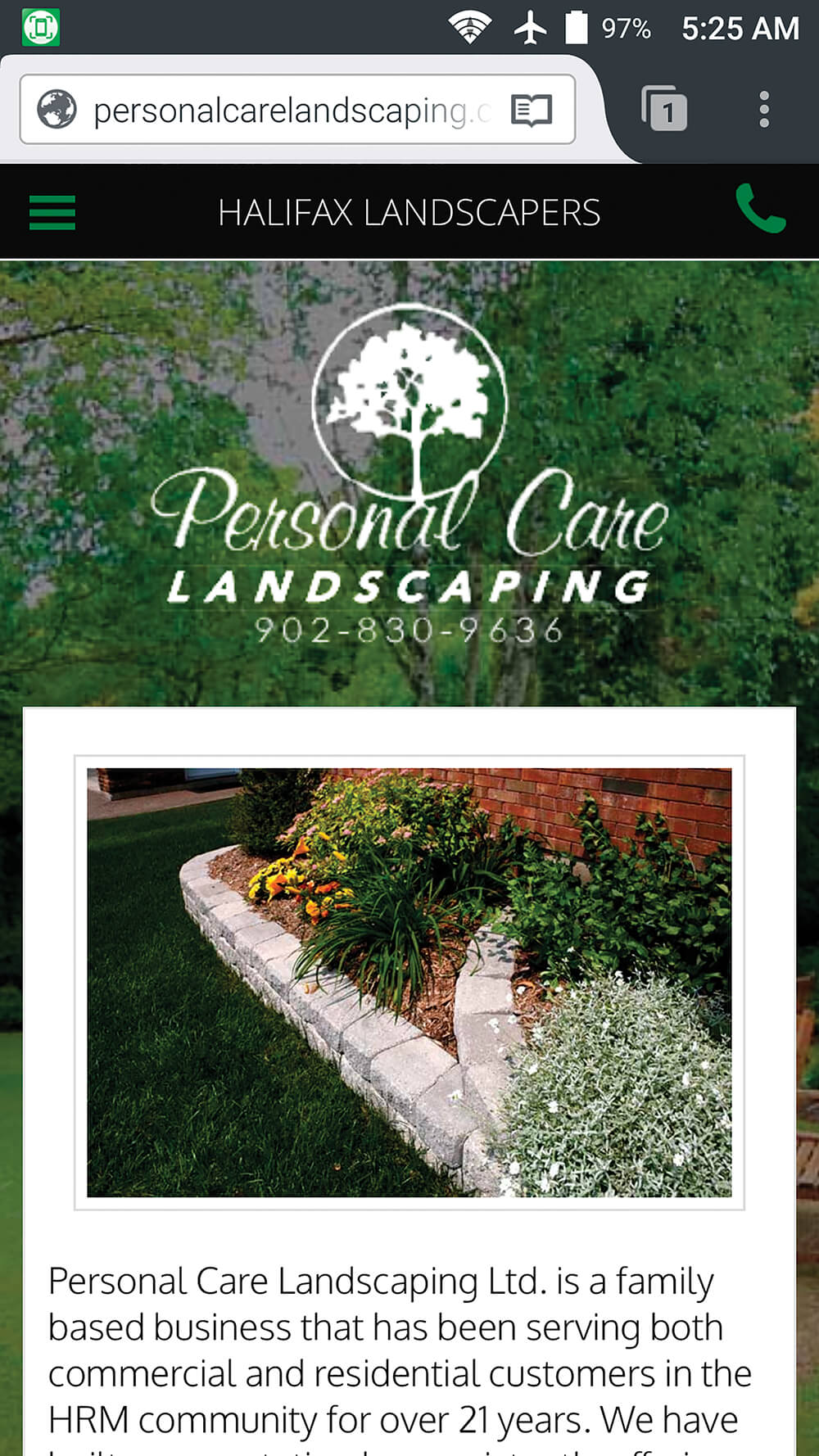 The Personal Care Landscaping site, viewed on a 5.5-in. screen, an example of a fully customized approach.
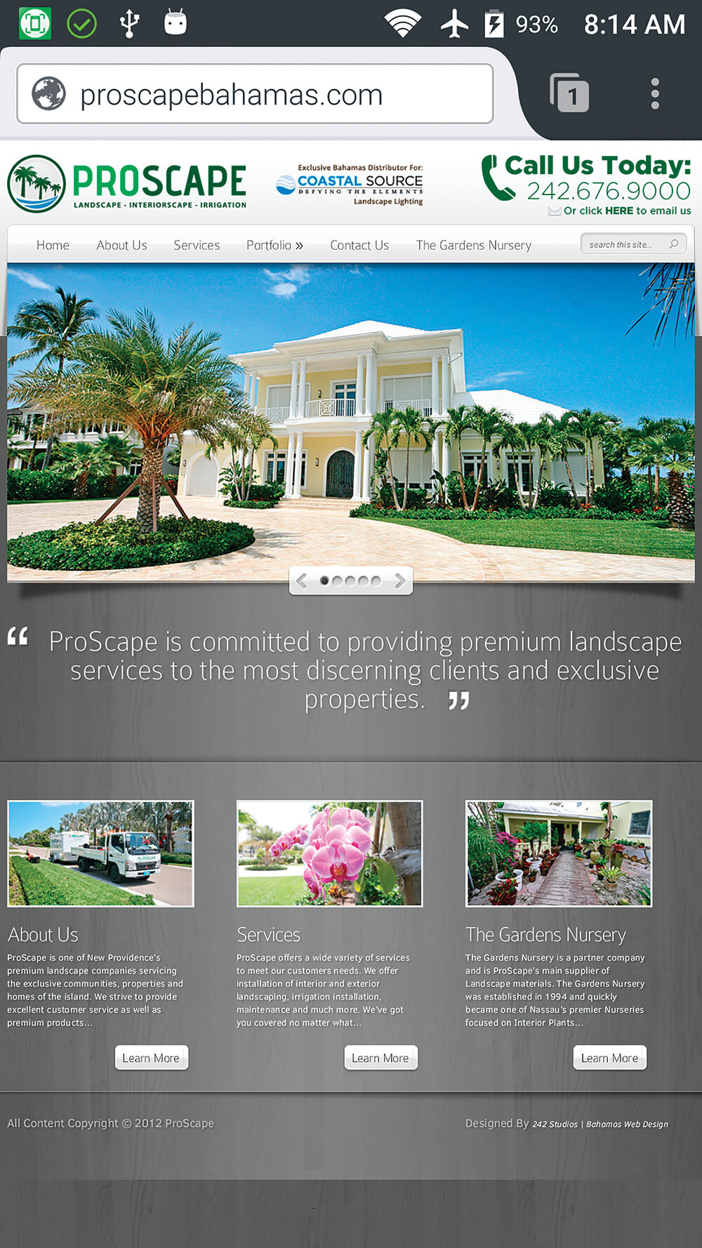 Proscape, displayed on a 5.5-in.
 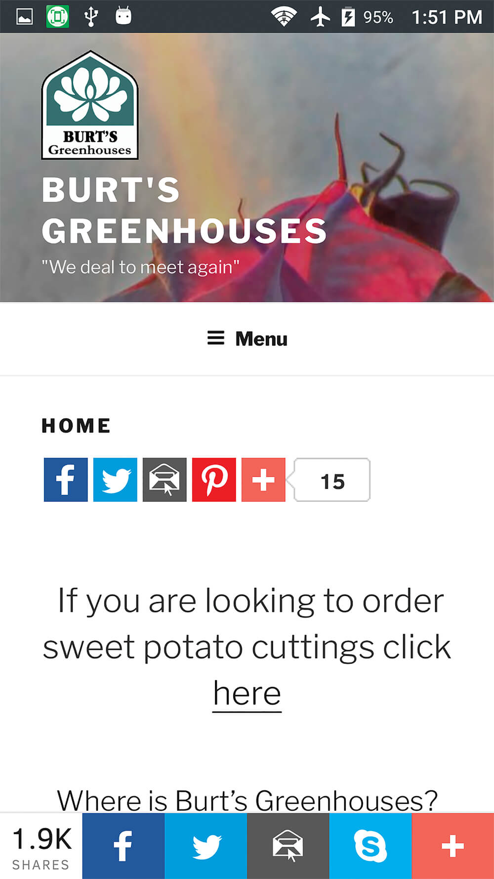 An example of a site generated by WordPress, Burt’s Greenhouses, viewed on a 5.5-in. diagonal screen.
A single code source for all devices
Some landscapers and nurseries have decided to use Facebook, or create content with WordPress and various plugins, to produce browser code. This code is able to sense the type of device in use and provide content specially formatted for screens, whether smartphone, tablet or desktop. Text and pictures float around each other on the page.WordPress interfaces are an alternative, and a wide variety of plugins are available. The pages must be presented through a browser, which may be limited to using a single core on a multi-core device. For the user this means doing only one thing at a time, limited by the browser’s capacity.
And yet others have decided to go the full customized professional route, for a website that is very capable on both desktop and mobile. Take the case of Personal Care Landscaping in Bedford, N.S., where Sean Murphy says, “Most of my quote requests come from the Internet, either our webpage or Yellow Pages online. Our site is fully mobile friendly.”
Dedicated applications
The most effective way to use all the features of a smartphone or tablet is to write specific software. Having done so, you will have at least two applications to maintain, the desktop version and the smartphone/tablet versions.The advantages of dedicated smartphone applications are ease and speed of navigation on small devices due to precise use of resources and elimination of the overhead a full browser requires. Also, access to special features such as the dialer, compass, location tracking via GPS, and direct access to multiple cores, allows more than one activity to progress at the same time.
The downside of a special app is you have to decide which operating systems to cover, how to distribute the app to your customers, and giving them the confidence to install it on their devices. Since there are browsers for all major operating systems and devices, simply loading a webpage is a breeze by comparison.
According to web analytics firm Statcounter, there are currently two major mobile operating systems in use on Canadian devices: iOS (61 per cent) and Android (35 per cent). With these two we can cover 96 per cent of current mobile use in Canada. However, if your target market is worldwide, then note that Android is more popular, with 69 per cent of market share, compared to 24 per cent for iOS. Distribution can be as a download through an existing website, email attachment or through a recognized app store.
Despite potential advantages, landscapers in general are not yet utilizing dedicated apps. An exception is Urban Seedling, where Tereska Guessing says, “We did build an app. We have a web developer on staff, but it was only for internal use.” And Brian Burt of Burt’s Greenhouses suggests, “My first reaction to the possibility of an app was no, but that is not quite true — it would depend on the development costs. We do online ordering and in theory we could have an app, but if you are not getting a lot of orders you can’t justify it. Mobile visitors at a guess are about 25 per cent and growing.”
Need to adapt
Mobile use is growing, and the trade is taking steps to respond to the trend. Landscapers are using available tools as best they can, and may need to continually review their online presences to ensure effectiveness.Colin Beckingham is a freelance writer living in eastern Ontario, with experience in the green industry. He works professionally with open-source solutions for database management, accounting, voice control and telecommunications.